Man, these are crazy times. It seems like everything in the media is tied to coronavirus, either the threat or the misinformation, depending on what you are reading. It turns out that from a data perspective, yes, yes, it is. All. About. Coronavirus. Despite our ever-shrinking media environment, coronavirus has gotten the most press coverage of any disease in recent history. By huge margins.
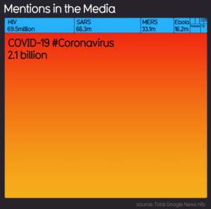
Source: https://informationisbeautiful.net/visualizations/covid-19-coronavirus-infographic-datapack/
According to this chart, COVID-19, the coronavirus in question right now, has nearly 20x the news hits of SARS, about 40X that of HIV. And Ebola, another hot topic, doesn’t even come close.
As a charts and graphs fanatic (and a media junky, not only for work but in general), I not only read the coverage but click on nearly every data visualization I see. This chart — from informationisbeautiful.net — jumped out at me because, WOW, is the media all over this. For better or for worse.
But I also think this one tied to the now trending #flattenthecurve discussion, is a good one with a lot of science behind it. Something to think about, even if you aren’t on the hype bandwagon.
So be prepared, not just for coronavirus (hope you already bought your toilet paper), but for much, much more media coverage of events, personal stories, more closures and more cancellations. We’re not through the storm yet, likely more in the eye of the hurricane. If you are looking for information, I recommend going to the CDC or World Health Organization. And for goodness sake if you aren’t feeling well, stay home!

